It’s an old trope amongst foodies that people eat with their eyes first, and this starts before the restaurant: keen internet sleuths scope out restaurants online before venturing to a new and unknown eatery.
Today, the team at Electric Sheep investigate the South African restaurant space in search of 5 restaurants whose websites invite and entice. The 5 chosen websites excel not only in design, but in user-experience, performance, and in implementing a well-resolved marketing strategy.
So without further ado, here are the 5 best instances of amazing restaurant website design in South Africa:
La colombe
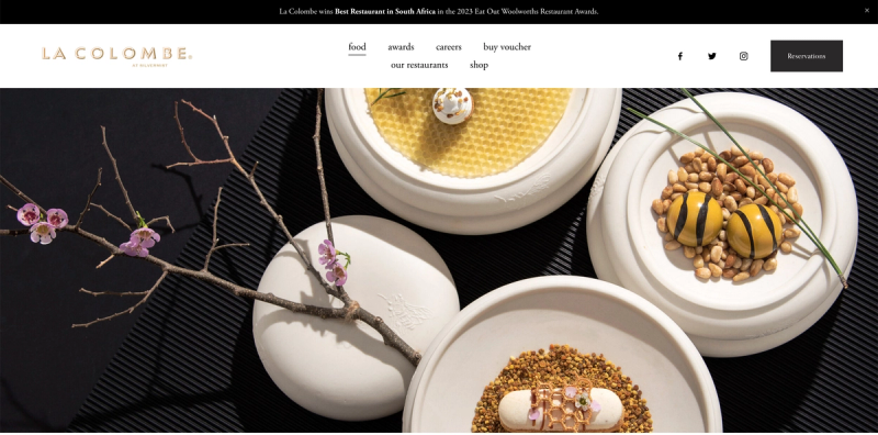
User interface design:
The first restaurant website on our list is La Colombe. The website sports a clean and ultra-sophisticated aesthetic. The menus are easily accessible from the home page, and the thoughtful layout of the site makes it a breeze to navigate.
The minimalistic interface translates to a superb mobile experience.
Technical performance (courtesy of GTMetrix):
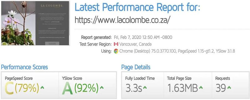
- Page speed - above average C(79%)
- Well optimised
- Fast fully-loaded time
- Superb YSlow score and great Waterfall Timings
Content & SEO (data from Ubersuggest):
La Colombe don’t have to say much to leave a lasting impression, with their beautiful wide-angled photography and a list of their numerous awards, you certainly know you’ll be in for a treat.
La Colombe has 839 backlinks, and they are generally of a high quality, giving La Colombe a Domain Rank of 22 according to Ubersuggest. Overall, we love their design and user experience. From an SEO perspective, they seem to be generating a fair amount of traffic — although much of that comes from people searching for their restaurant name.
The test kitchen
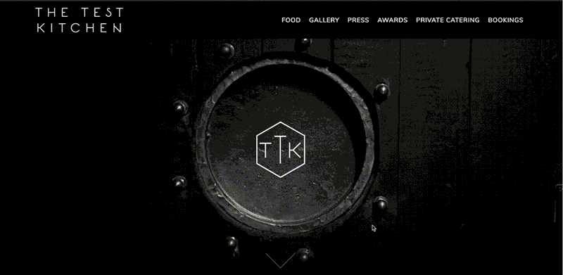
User interface design:
The Test Kitchen does a great job of grabbing visitors’ attention with the video animation in the above-the-fold space. The dark, monochromatic colour-scheme captures the essence of The Test Kitchen. This design captures the feeling of the restaurant, whether it be the dark room or the light room.
The layout makes super it easy to reserve a table using the conveniently-placed bookings button in the top right corner. The Test kitchen have definitely prioritised the user experience with their well optimised website.
Technical performance (courtesy of GTMetrix):
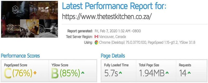
- Respectable, C(76%) Pagespeed Score.
- 5.7s fully-loaded speed (not bad considering test server is in Vancouver)
Content & SEO (data from Ubersuggest):
The Test Kitchen is another minimalist win. In terms of content they give you just enough, leaving you intrigued and wanting more.
With 12600 organic monthly visitors and 1751 backlinks — very impressive — The Test Kitchen clearly don’t have a problem attracting new customers.
Kyoto garden japanese restaurant
User interface design:
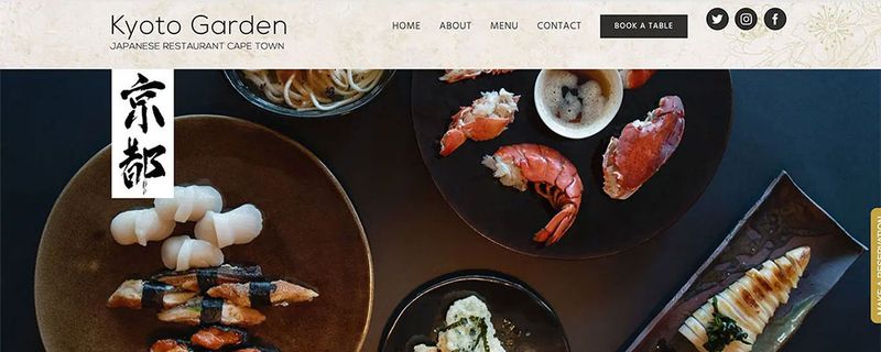
Kyoto Garden is a Japanese restaurant and their website design communicates that. The use of traditional Japanese symbols like the cherry blossom tree and authentic spript captures the subtle taste of Japanese culture, leaving a lasting impression and a site to remember.
The mobile design is decent, however the text could be slightly bigger, making for an easier read.
Technical performance (courtesy of GTMetrix):
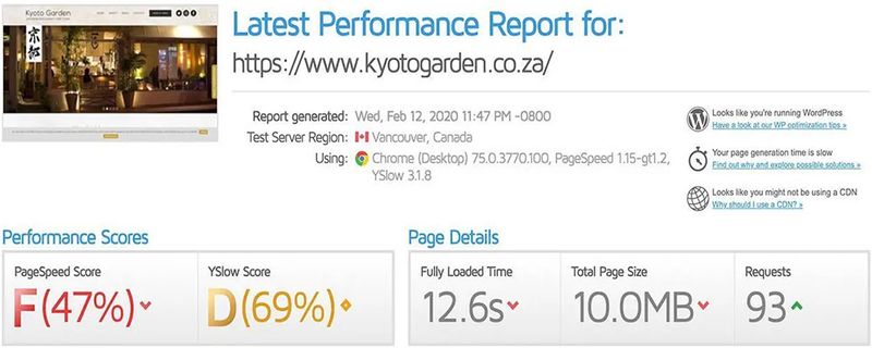
- Page speed is poor
- Time to fully load is 12.8s
- Website in dire need of optimizations
- Homepage size is a huge 10.0MB
Content & SEO (data from Ubersuggest):
Kyoto Garden displays a testimonial by The Sunday Times which lends the restaurant credibility, and helps build social proof. The about page is rich in useful information too.
Their website only has a domain score 3 and has 40 backlinks, which isn’t the best. However, they do receive 634 organic visitors per month.
The website design is easy-on-the-eye, however the site could use some serious SEO and performance updates.
Willoughby's & Co. restaurant
User interface design:
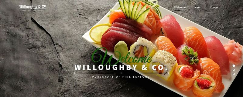
The Willoughby’s home page is simple-yet-powerful. The parallax scrolling effect adds movement to the page. The choice of typography creates an elegant aesthetic and the use of white space gives the beautiful content breathing room. The photography is colourful and vibrant. All these components combine to make this design stand out and capture the viewer’s attention.
Technical performance (courtesy of GTMetrix):
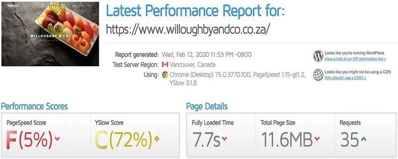
- Fully-loaded time is relatively poor (7.7s)
- PageSpeed score is (F)5% — the worst on our list.
- homepage is a massive 11.6MB (largely due to unoptimised images)
Content & SEO (data from Ubersuggest):
In terms of content, the homepage is very light. The little content that is there, however, is nice and conveys what the restaurant is about. The hero section of the homepage greets the visitor with the tagline: “Purveyors of Fine Seafood”. This is great because you immediately get what this eatery is all about: high-end seafood.
It appears this website has had some recent SEO work done on it as its organic reach and traffic started taking off in September 2019. The site is now estimated to receive approximately 989 organic visitors per month.
Marble
User interface design:
Marble’s grid-like design and streamlined content make the website’s content easy to read and navigate. Paired with beautiful parallax sections, the site is stylish and engaging.
The site boasts all-round great typography, a user-friendly layout, and great photography.
Technical performance (courtesy of GTMetrix):
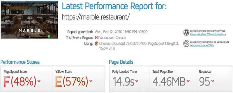
- Fully loaded time is an abysmal 15.8s
- Page speed score is an (F)48%
Content & SEO (data from Ubersuggest):
Marbles content is strong. Its home page is particularly well designed, abundant with necessary and unique information. The biggest compliment we can pay this website is that it makes you want to visit the restaurant.
The site attracts a whopping 8460 organic visitors per month and has 836 backlinks.