
92% of people online use search engines and 59% of them do so at least once daily. That works out to 175 billion global monthly searches.
Most laypeople, who don’t yet have a lawyer (or know of one), do one thing to find a legal firm when they need legal support: you guessed it, they sit down in front of their computers and hit Google.
Even people (individuals or company representatives) who know of a few firms often pull up a few legal websites for comparison they even decide who to email or call.
Firms that are poorly optimized for SEO aren’t even part of the conversation (but that’s a topic for another time).
This article is focused on South African legal companies who are harnessing incredible results having a well-designed site can yield. And make no mistake:
legal firms invest in great websites.
Legal firms with outdated, or poorly designed websites are losing money. And lots of it. Think about it: a big case can be worth hundreds of thousands of Rands. Even 1 big client lost because of a bad website is way too many.
Firms that venture boldly into the website design space can make ten-fold the cost of their redesign back in a single year, through the new business a great website invariably brings.
And now, without further ado: The Top 3 Best Designed Legal Websites in South Africa (in no particular order)
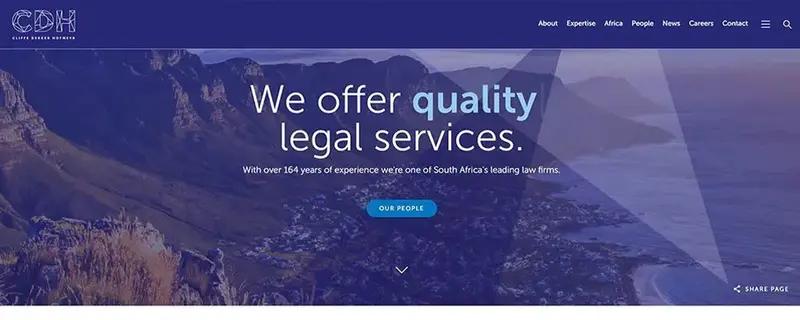
Cliffe Dekker Hofmeyr
Why it works:
This site is probably my pick of the bunch. Let’s get into why exactly it works so well:
The first thing that catches my eye is the hero photograph. The beautiful and local oceanic vista emphasises the power of great photography in designing a site. So many legal sites make the mistake of opting for cheesy stock photography. It appeals to no-one. Ever. The picture is unique and real. It’s crisp, not pixelated, and the localness of it breeds a sense of familiarity.
Next, the above-the-fold headline continuously (and stylishly) cycles between 3 sentences to display the firm’s core values:
The 4 underlined words: trusted, agile, collaborative, and quality are especially poignant when dealing with this site and they are all reflected through different aspects of the design.
Trusted: the first clickable button: ‘our people’, takes the visitor to a team page where they get to see the size of the Cliffe Dekker Hofmeyr team.
Showing the visitor exactly how many staff they employ clearly demonstrates just how big and established this company is.
It exudes gravitas, builds trust, and makes prospects feel safe.
Collaborative: Below the banner are links to all sorts of articles. This shows that this isn’t an isolationistic firm.
It’s open, and a part of the world. It feels like more than just a company website; it feels like a network.
At the bottom of the page there’s even a breast cancer awareness banner. This company is showing that it’s human. That it cares.
Agile: the entire site reflects an agility and a fearless approach to being on the cutting-edge.
It’s fast-loading, fully-responsive, is full of animations, movement and parallax scrolling effects.
Quality: This one’s easy. The site is obviously high-quality and the result is a site that sings with finesse.
This shows that the firm is innovative and with-the-times.
The site also makes great use of white space. I found the initially invisible menu bar a subtle-yet-powerful minimalistic touch.
Technical performance (courtesy of GTMetrix):
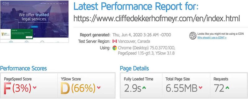
- Page speed - poor F(3%)
- Total page size - 6.55MB (very large)
- Fast fully-loaded time – 2.9s (not bad considering page size is so large)
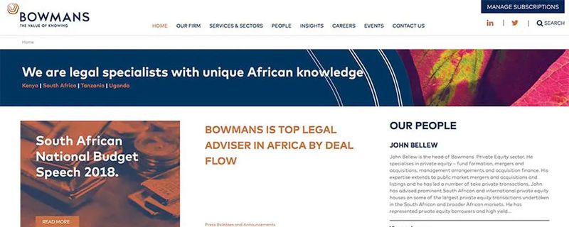
Bowmans
Why it works:
This website works on multiple levels. The first text you encounter after the menu is on a slider which cycles through news headlines from the firm’s blog. This includes items from honours and awards, to opinion pieces.
This shows a brand that is alive, that has a voice. This is crucial to building trust. Mentioning their awards establishes them as a leading firm that can be relied on.
Aesthetically, this site is fantastic. There’s enough white space for a balanced finish. But, what really stands out is the colour harmony and the exploration of texture.
The website sticks to a colour theme and uses it throughout. The use of blues and ochre colours, even in the selected photographs makes for an exceptionally eye-pleasing site.
This fastidious consideration to colour makes for a site that’s greater than the sum of its parts.
The photographs are exceptionally well-selected and many of them are macro-photography close ups of textures.
The result is an aesthetic quality that shows the visitor (even on a subconscious level) that this firm is meticulous and serious.
This a far cry from what sourcing corny stock photography can subconsciously communicate about your legal services.
There’s not a single page on this site that went under the radar and every page makes similarly stand-out design and photography decisions.
This is a site that exudes value.
Technical performance (courtesy of GTMetrix):
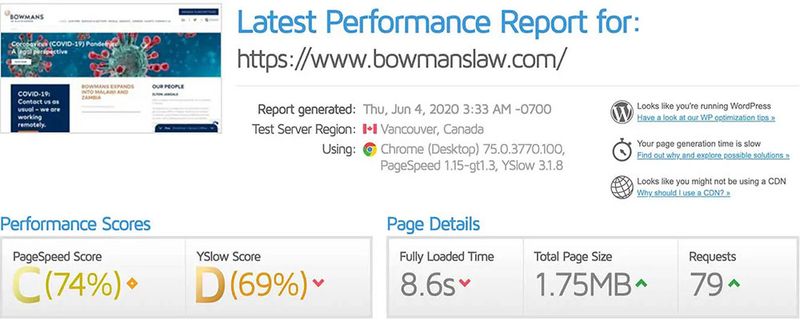
- Respectable page speed score C(74%)
- Below average YSlow score B(69%)
- 8.6s fully-loaded speed
- Overall the website is functioning averagely
KISCH IP

Why it works:
Most people know that good photography makes for great websites. This site flies in the face of that conventional wisdom. The Kisch IP website boldly went sans photography, and it works. Damn well.
This is largely down to the use of custom graphics and designs.
The top banner image on the home page simultaneously communicates trust, whist demonstrating an innovative spirit.
This dichotomy can be seen when examining the right and left of the banner separately.
On the left we see bold headlines supported by cutting-edge graphics. The colour harmony reflects the rest of the site, and the strong typography makes you stop and take notice. These considerations impress on the visitor that this is firm with its finger on the pulse.
Conversely, the copy on the right speaks about heritage and the firm’s 140-year-history. This establishes trust and credibility.
The design communicates a best-of-both-worlds firm. One that’s established, and proud of its history. Without coming across as an old-timer. In fact, it conveys a spirit of innovation.
Website’s have the power to make small firms appear powerful, well-established and trustworthy. On the other hand dated sites can make even industry giants seem tacky and careless.
The above sites are great examples of the direction South African legal website design should be going in. If you think I missed any, please let me know, and I’ll happily consider revising this list.
Technical performance (courtesy of GTMetrix):

- Page speed score C(79%) - the best on our list
- Superb YSlow score B(81%)
- Decent fully-loaded time
*Disclaimer: Electric Sheep Creative Agency has no affiliation to any of the above firms. This article simply offers review and opinion on website design in the public domain.